pro set vi
pro set vi
A visionary collection of color palettes, sensitively designed to simplify the modern photographer’s workflow. Beautiful rendering for all of your favorite looks - from high-definition bold to soft and dreamlike. For Lightroom 6/CC, Lightroom Mobile and Adobe Camera Raw 9/10/11.


A visionary collection of color palettes, sensitively designed to simplify the modern photographer’s workflow. Pro Set VI is a streamlined addition to your editing toolkit, providing beautiful rendering for all of your favorite looks - from high-definition bold to soft and dreamlike.
Completely new to Pro VI is a unique and versatile Soft series, for the most delicate gradients, luminosity and subtle, soothing colors - perfect for use across all lighting situations, including difficult backlit or high contrast scenes; a collection of Bold edits for rich color and contrast and strong visual impact; classically inspired Black & Whites with improved tonal range; and luminous Pastels with a variety of contemporary palettes to suit every style.
Each of the 25 color grading presets in this set features 3 versions for ease and flexibility in choosing the strength of the effect, from subtler to stronger. This allows you to efficiently choose and apply your preferred edit without the need for tweaking, and also enables faster application of a cohesive look to a session with varying light. Each product has been carefully handcrafted for reliable, versatile editing - both on desktop and on the go.
Features to note for Pro Set VI:
Improved reliability and consistency in application to all file types, including mobile photography.
A unique and versatile Soft series, for rendering delicate gradients, luminosity with incredible highlight detail, and soothing colors - perfect for use across all lighting situations including difficult backlit and high-contrast scenes.
New Bold color grades for rich color, contrast and impact.
A new Pastel series with vivid to subdued color palettes, featuring softer light and highlights, enhanced skin tones, and more consistent application to a greater variety of lighting situations.
A collection of classically inspired black and whites, with improved tonal range.
All products have improved sharpening techniques, a cleaner finish with more subtle grain and vignetting, and are optimized to create beautiful and luminous skin for all types of skin tones, minimizing the need for retouch.
Designed and extensively tested on all camera models including Canon, Nikon, Leica, Fuji, Sony, Hasselblad and Phase One.
Application for both RAW and JPG.
Lightroom 6/CC, Lightroom Mobile and ACR 9/10/11 versions included.
Pro Set VI is accompanied by a new toolkit with 30 tools for quick adjustments to toning, clarity, sharpening, contrast, vignetting, grain, and white balance. A convenient “Reset Presets” tool allows you to reset all settings without losing your crop, exposure or white balance corrections.
Pro Set VI contains 105 individual presets. A complete list of included tools and presets is below:
Black & White
Arctic I, II, III
Casablanca I, II, III
Fog I, II, III
Glacier I, II, III
Graphite I, II, III
Bold
East I, II, III
Mars I, II, III
North I, II, III
South I, II, III
West I, II, III
Pastel
Berry I, II, III
Cannes I, II, III
Coral I, II, III
Matcha I, II, III
Paris I, II, III
Venice I, II, III
Soft
Astrid I, II, III
Camp I, II, III
Clay I, II, III
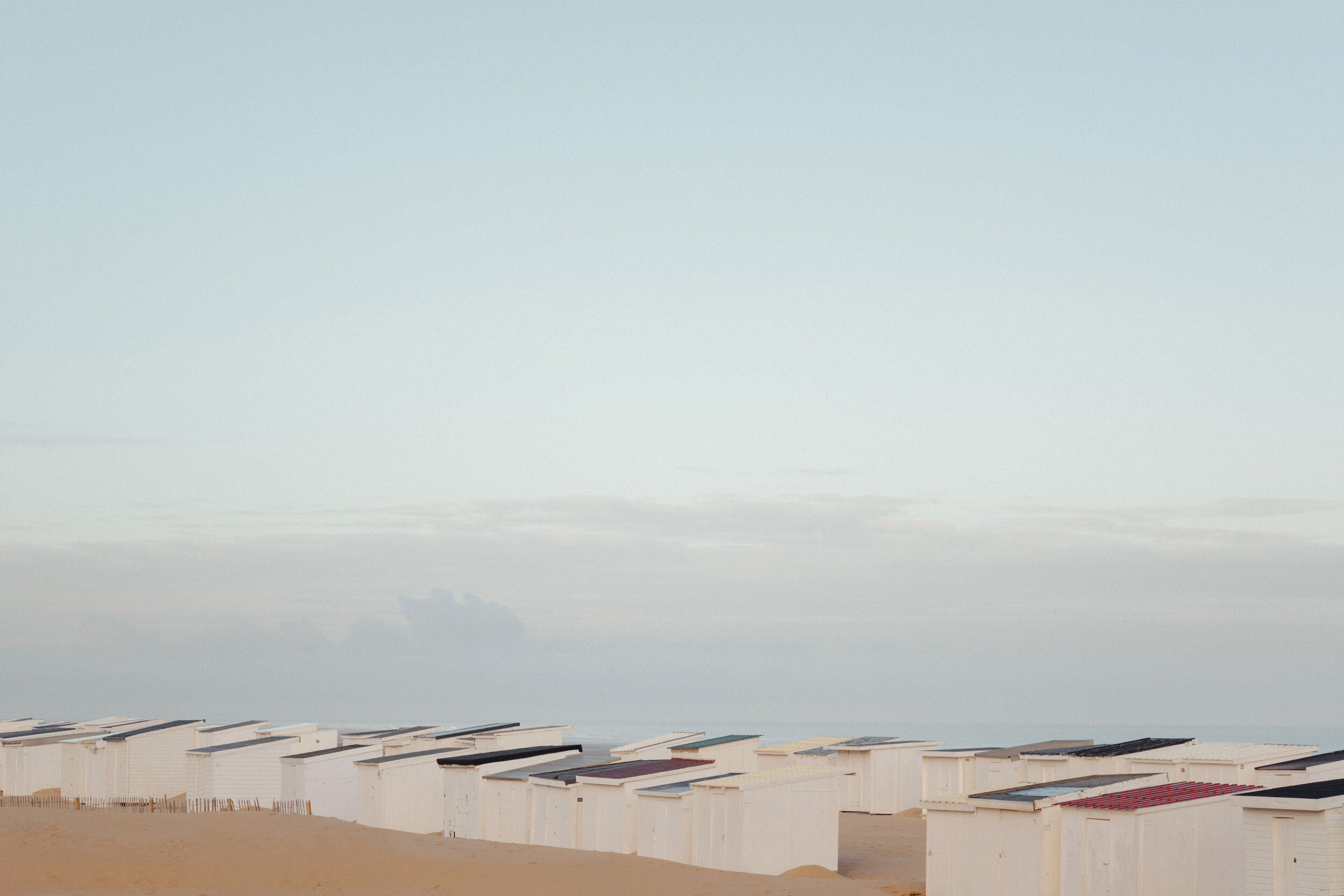
Dove I, II, III
Fir I, II, III
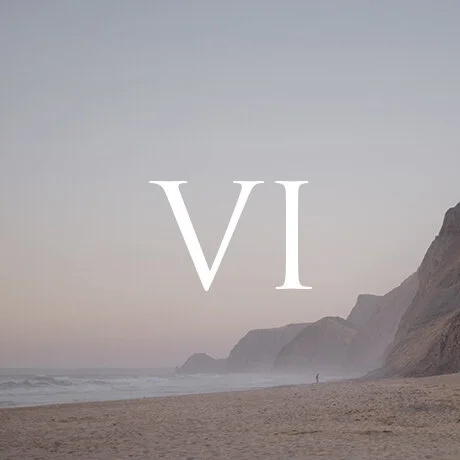
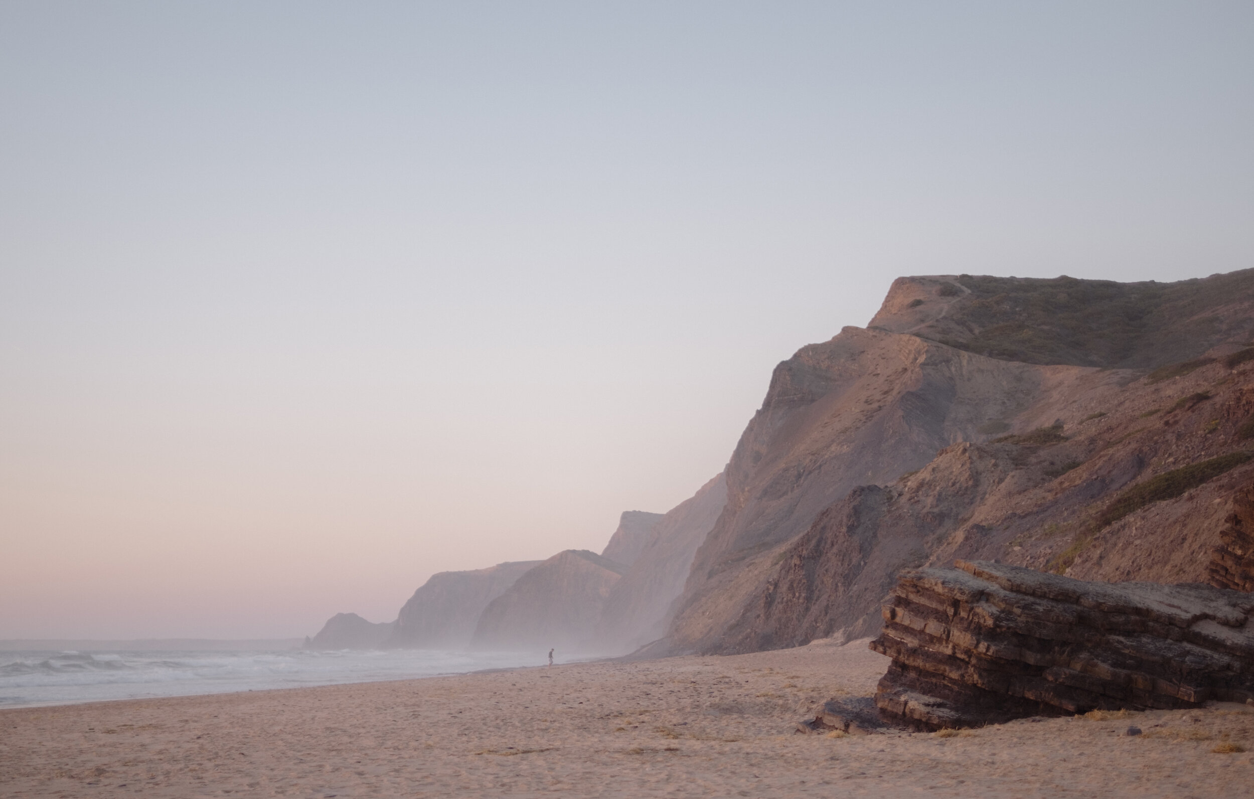
Reef I, II, III
Sedona I, II, III
Sunrise I, II, III
Sunset I, II, III
Reset Presets
Auto White Balance | Reset
Auto White Balance
Clarity | Reset
Clarity +
Clarity ++
Clarity +++
Clarity –
Clarity – –
Clarity – – –
Contrast | Reset
Contrast +
Contrast ++
Contrast +++
Grain | Reset
Grain | Big +
Grain | Big ++
Grain | Small +
Grain | Small ++
Sharpening | Reset
Sharpening +
Sharpening ++
Sharpening +++
Tone | Reset
Tone | Cold
Tone | Warm
Vignetting | Reset
Vignetting +
Vignetting ++
Vignetting | Outer Glow
Lightroom 6
Lightroom CC
Lightroom Classic CC
Lightroom Mobile
ACR 9
ACR 10
ACR 11
(Photoshop CS6/CC)
File Types:
RAW or JPG

Subdued highlights with brightness and subtle rose tones.
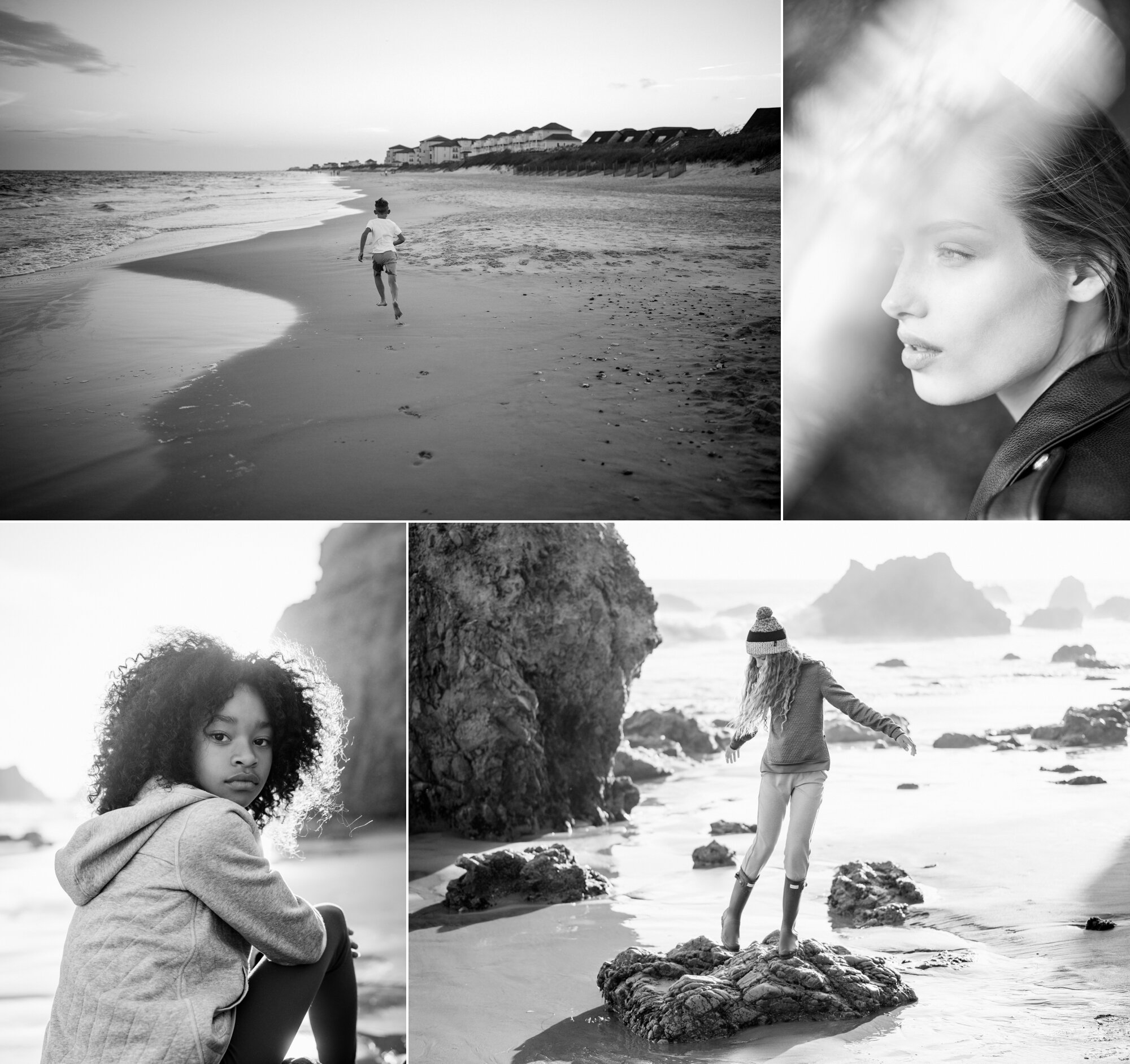
Images: Jake Debruckyere.

Vivid color and more contrast, enhances blues and aquas.
Images: Jane Kim.

A soft pastel with warmth and lower contrast.
Images: Pei Ketron.
Delicately bright with clean whites and beautifully treated greens.
Images: Marcus Lloyd.

Lavender and pink undertone, softer contrast and subdued color.
Images: Sam Nute.

A bolder and balanced pastel.
Images: Jake Debruckyere.

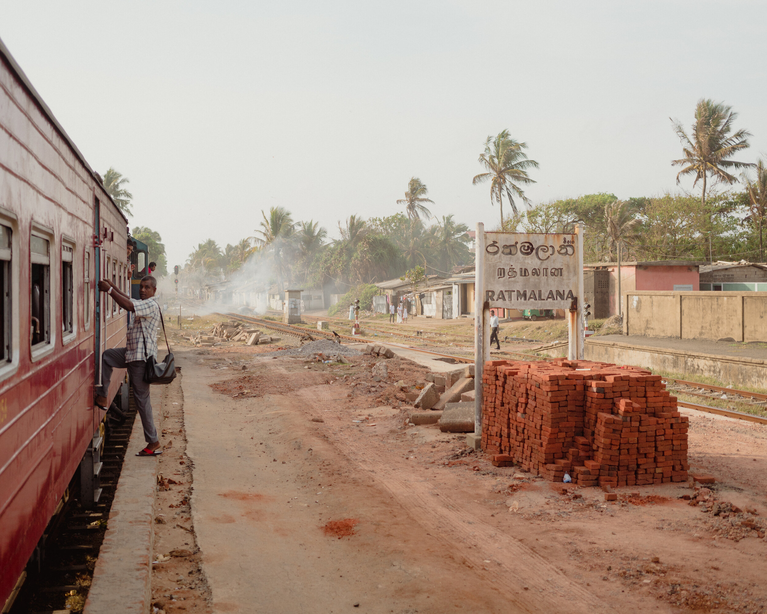
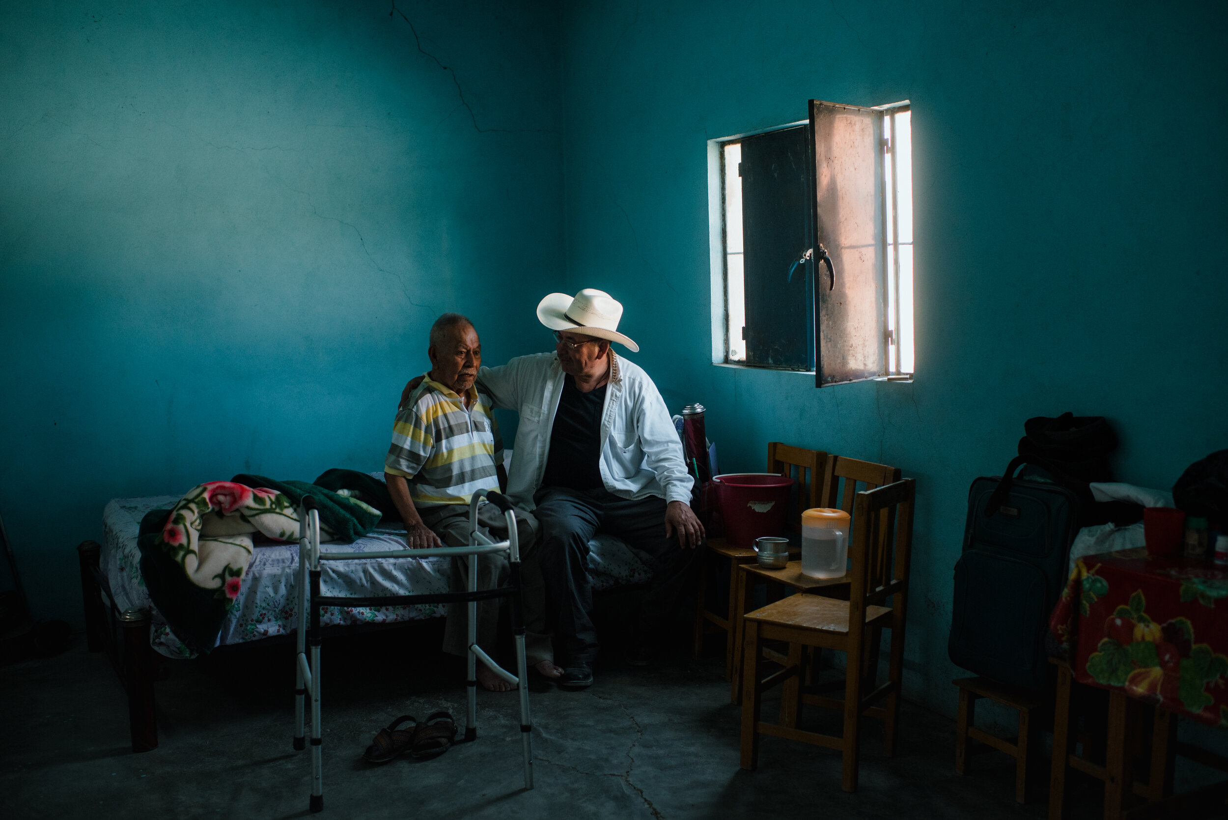
Warm light, rich shadows and earth tones.
Images: Dan Rubin.

Subdued highlights and a soft palette with more saturation.
Images: Dan Rubin.

A faded palette with even light and emphasis in the warm tones.
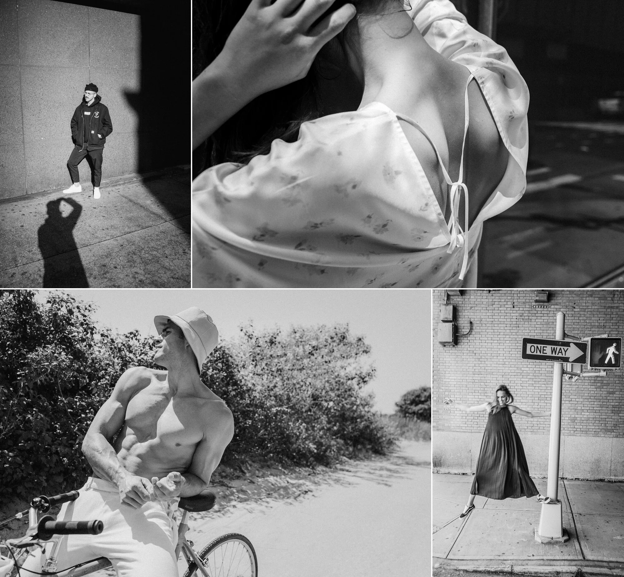
Images: Victoria Wright.

Soft grays and mild contrast with preserved warmth.
Images: Om Malik.

Olive, ochre and rich blacks .
Images: Joshua Allen Harris.

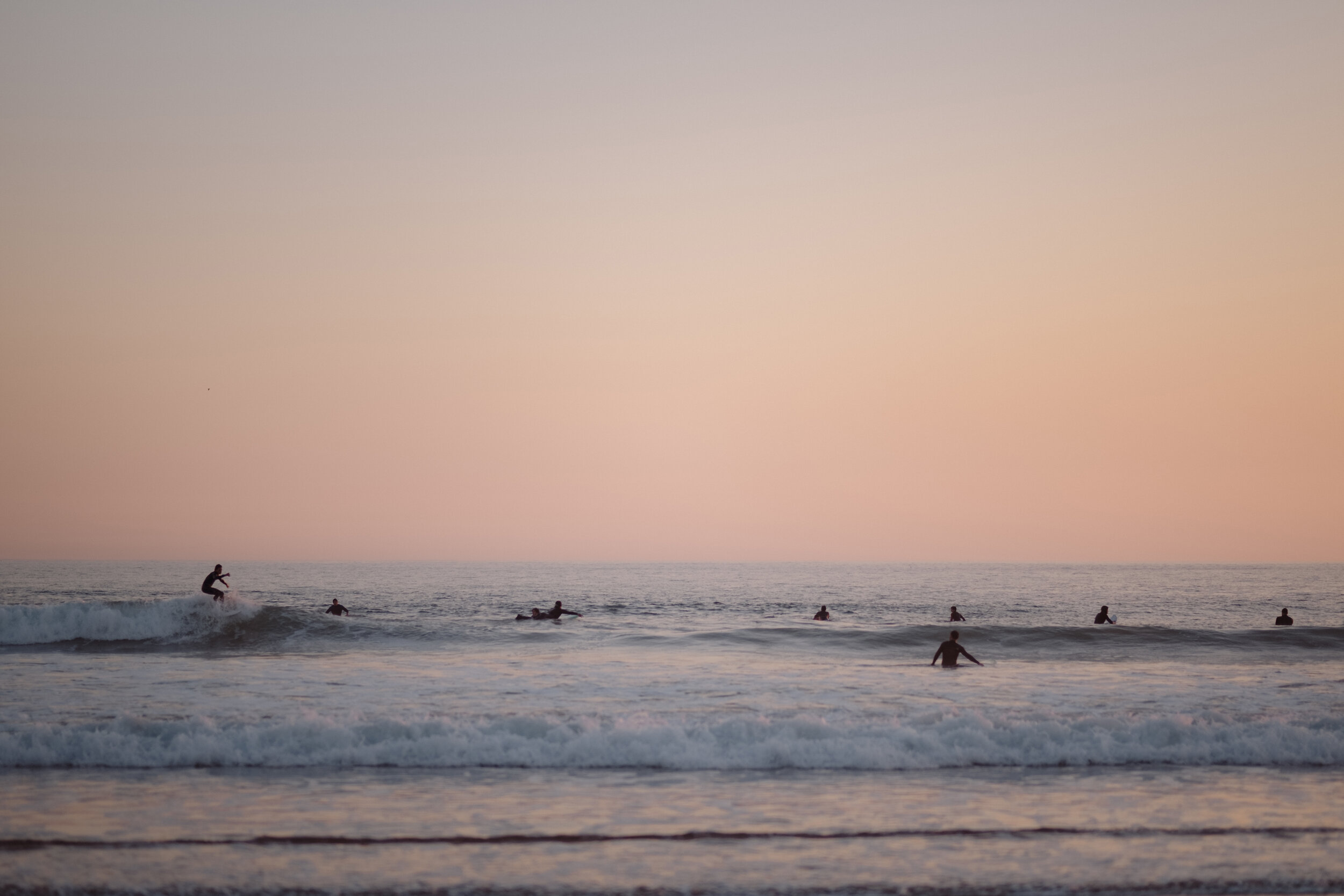
Hazy blue, soft gradients and gentle toning.
Images: Chelsea Ruggiero.

Desaturation with stronger contrast and reds.
Images: Nate Canada.

The most subtle gradients, colored in pink and light blue.
Images: Sonia Davies.

Makes any light a little more like golden hour.
Images: Lavinia Cernau.

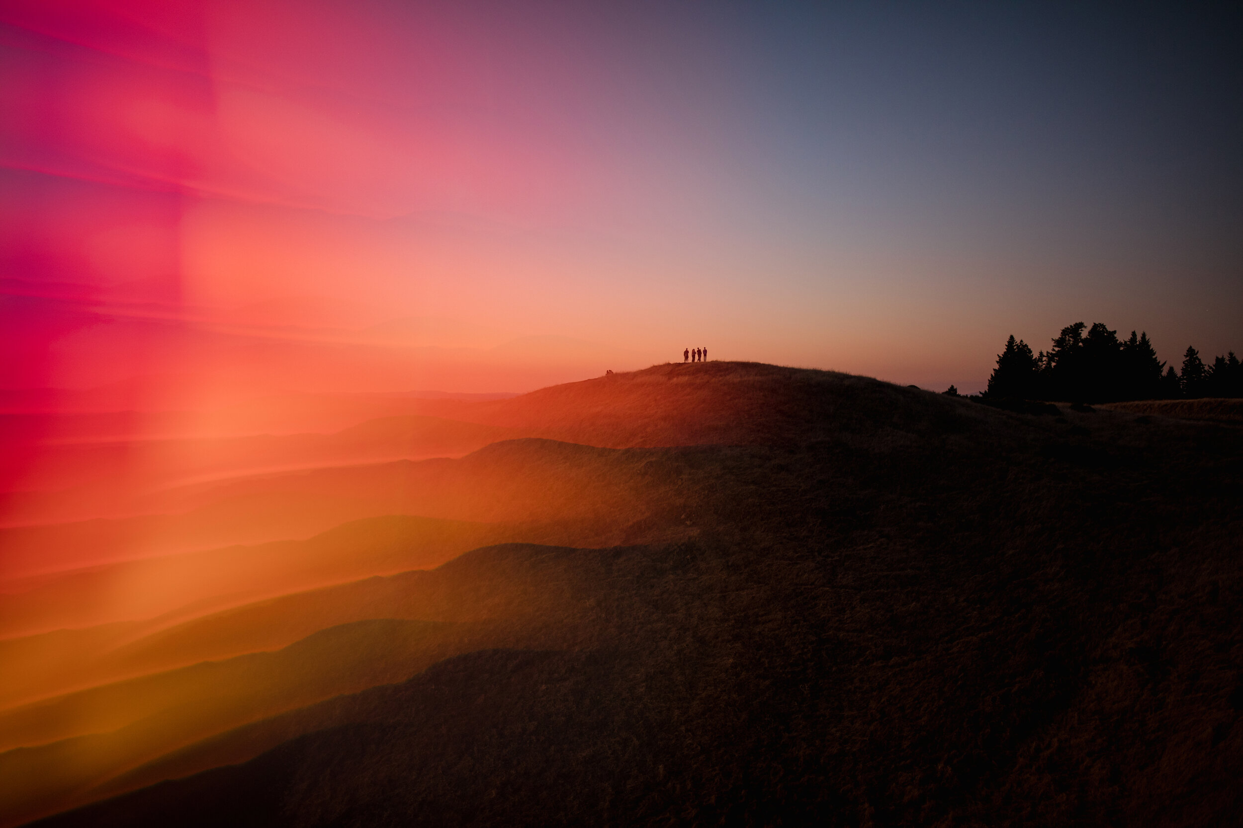
A cinematic effect with intense blues and saturation.
Images: Chris Ozer.
Warmer tones, highlight detail and pronounced oranges and reds.
Images: Jordan Ison.

Strong blacks and contrast around a gray toned palette.
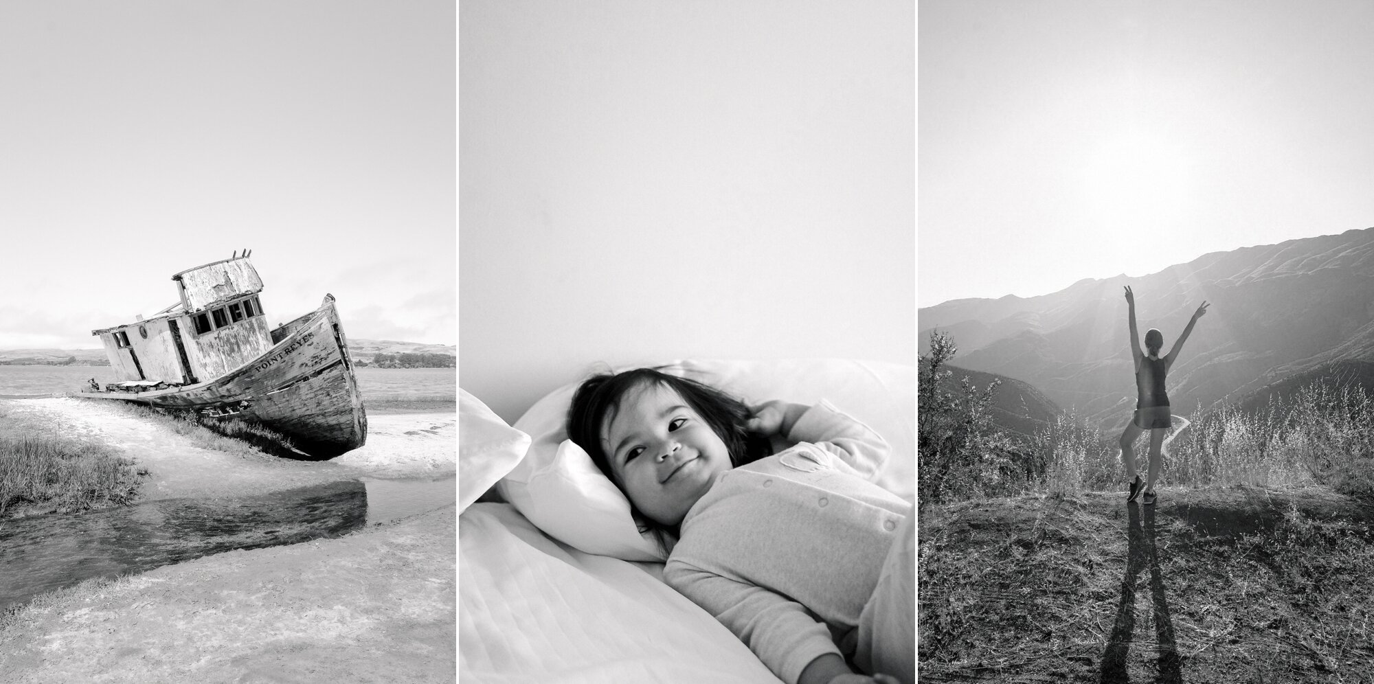
Images: Finn Beales.

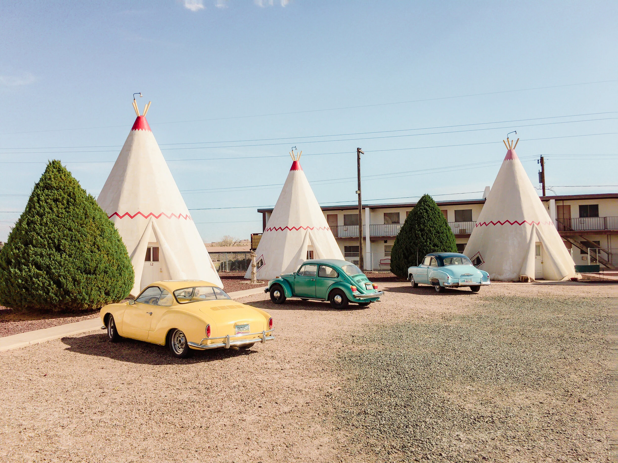
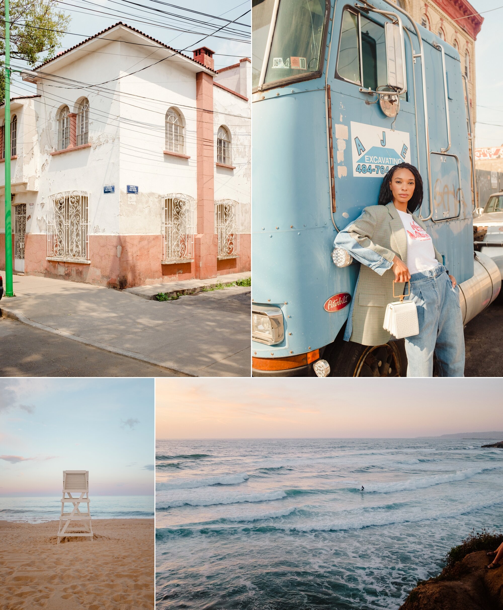
Bright light, more contrast and warmer, vivid colors.
Images: Adrienne Pitts.

Brilliance, vibrance and strong blacks.
Images: Ryan Christopher Jones.
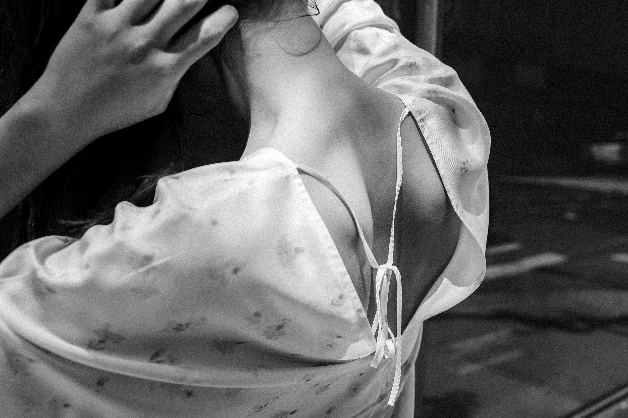
A bright monochrome with more grain and higher contrast.
Images: Chris Ozer.
Dark, rich and smooth throughout the tonal range.
Images: Joshua Allen Harris.
Soft light and lower contrast.
Images: Bianca Elizalde.

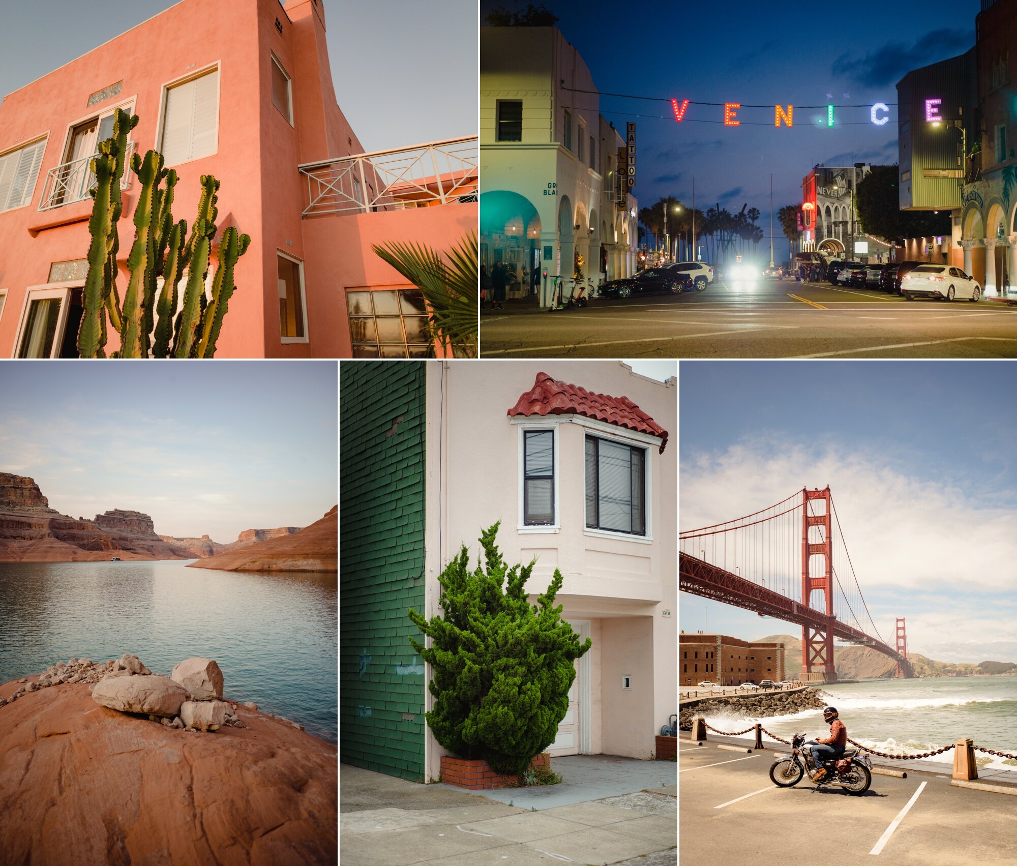
High definition and perfectly rendered shadows.
Images: Christopher Michel.

Richness and intensity from light to dark.
Images: Pei Ketron

A visionary collection of color palettes, sensitively designed to simplify the modern photographer’s workflow. Beautiful rendering for all of your favorite looks - from high-definition bold to soft and dreamlike. For Lightroom 6/CC, Lightroom Mobile and Adobe Camera Raw 9/10/11.