Pastel Post Processing and Fuji Colors
Since my earliest adventures in photography and post work, I have been drawn to the “pastel look” – a light, airy style with soft colors, glowy brightness, and subdued contrasts. Achieving this with my digital images required a lot of time and patience, and as I discovered, it was a rather difficult look to get right.
When I first discovered film, I found there was a similar trend among film photographers (specifically in the wedding industry) towards a pastel color palette. If you peruse the Internet for film wedding photography, you’ll find that a bright pastel look is a common theme – and to achieve it, you’ll see a combination that repeats over and over: Contax 645 with the Zeiss 80mm f/2.0, Fujifilm Pro 400H, and scanning and processing by a reputable pro photo lab. While similar effects are had using other cameras and films, the results of this particular combination have become almost an almost instantly recognizable look. Many of the world’s top wedding photographers, such as Jose Villa or Elizabeth Messina, have made this look very popular.
These signature pastel colors are created with the combination of the Fujifilm Pro 400H color palette, the right exposure, and how the scans are processed by the lab. So can this formula be translated to digital? Let’s examine these steps one by one.
1. THE FUJIFILM PRO 400H COLOR PALETTE
Fuji Pro 400H film looks wonderful when it’s overexposed. The colors overall get warmer, the mid-tones (especially reds and blues) get poppy and bright, and highlights take on a peachy tone. This palette is the perfect base for pastels.
Pastels are possible with any digital camera, but some color palettes simply translate better to pastel hues. I have worked with Canon, Nikon and Fuji digital cameras, and in my opinion, the Canon color palette works better for pastels than the Nikon. But my favorite digital for pastels is the Fuji. I have worked with both the Fuji X-Pro1 and the X-E1, and as I shoot Fuji Pro 400H film as well, I was especially interested to see how the color palettes of Fuji digital and Fuji film compare. I put this to the test recently and compared side-by-side shots of the Fuji X-E1 and Fujifilm Pro 400H to show how similar the palettes are.
If you’re a digital shooter and you love this “film pastel” look, or just the look of pastels in general, in my experience the best place to start is with a Fuji digital camera. You will automatically get the base palette that translates most alike to what you see from a lot of film photographers who are shooting Fujifilm, and if you’re picky about the colors like I am, you’ll probably be happiest with the Fuji palette. Fuji does reds and blues like no one else, and unlike what you see from a lot of other digital cameras, greens and yellows look much more natural and pleasing from Fuji. The tone of Fuji’s colors, plus the intensity of the color, is just the right starting point for getting pastels – and will require the least work to get there.
But regardless, this look can be achieved with other digital cameras too, as long as the exposure is right – which is the next point:
2. PROPER EXPOSURE
Film photographers know that Fujifilm Pro 400H needs at least a stop of overexposure just for “proper” exposure (it’s commonly considered more of a 200-speed film than 400), but for a pastel result I like to overexpose at least 2 stops. Photographer Johnny Patience demonstrated this recently using a Contax 645 and Pro 400H film over a 5-stop range. You can see the pastel tones come out at about +2, and from there it gets more saturated & contrasty with each additional stop.
For obtaining pastels with digital, you need the right exposure as well. If you expose for zero, or what your camera interprets as “proper” exposure, you may have difficulties getting pastels in your final result. I shoot my digital images a bit overexposed. This lifts the shadows, lessens harsh contrasts and pushes mid tones and shadows into the upper mid tone and highlight tonal range – the tonal range of pastels. This is a crucial and often-overlooked step. Many people who are frustrated by not being able to achieve this light, airy look are simply starting out with an exposure that may be technically correct, but too dark for pastels.
It’s very important to note that you won’t get the same results just by bumping the exposure later in Lightroom or other RAW processing software. Colors are based on your original exposure, because your camera renders shadow tones differently than mids or highlights in-camera. If you brighten up shadows later, that base shadow tone still remains – it’s just artificially brighter. This can often produce a very unflattering result. The same concept applies for exposing portraits. I always expose in camera for the skin tone at +1, so that my camera interprets the skin tone as an upper mid or highlight tone. If you expose skin tone at neutral gray or zero (which your camera will try to do with auto settings), it would interpret skin tone as a mid tone, which is the wrong zone. When you try to brighten the image up later, it’s likely you will end up with a color cast to the skin. Personally I find that overall it is better to expose it right in camera than to make exposure adjustments later.
Overexposing is much more tricky with digital than it is with film. Film is extremely forgiving in this regard; as long as you don’t underexpose, you’re pretty safe. When I shoot Pro 400H I shoot it about 2 stops overexposed. But unlike film, if you try to shoot +2 or more with digital you will end up with severely blown-out, washed-out images. I try to stick to a rule of thumb of always shooting RAW, and exposing +1/3 – +2/3 stops in digital, and this works even better with Fuji’s digital cameras. The X-E1 and its X-sensor counterparts have a remarkable dynamic range and color rendition in difficult lighting situations. Although the X-Pro1 and X-E1 can’t exactly replicate film, they get much closer to a film result than any other digital I’ve used – and even with shooting a stop (or more) overexposed sometimes, they still retain great highlight detail. This makes the Fuji X-series cameras the best currently available digital cameras, in my view, for the pastel lover. You can overexpose your images without too much worry about highlight detail loss.
If you want to shoot a bit brighter but don’t want to change your metering style, you can just use exposure compensation on your camera to ensure that you end up with the result you want.
3. POST WORK
The pastel look you often see in film wedding photography is the result of applying certain scanner settings, density correction or color profiling by the lab, which tweak brightness, contrast and color tones. Post work is a necessary step when scanning film. For example, when Pro 400H (and other films) are overexposed, they get very contrasty and saturated. Pro labs will often density correct in scanning to even out the exposure and make the overall result more harmonious and pleasing. Scanners also have the ability to correct color casts, add warmth or coolness, and affect color tones.
Obtaining a pleasing pastel result for your digital images will require post work too. While you don’t have the problem of harsh shadows with overexposing digital, you have another set of problems: highlights might blow out, color tones need work, and the contrast might not be enough. This is where post processing comes in and where it’s crucially important to treat your images carefully. Pastels are delicate, and so is the post process that they require.
If you enjoy playing around in Lightroom, ACR or Photoshop, here are a couple of hints that might help you as you work on your pastels:
– Find balance. White balance is extremely important. While Fuji gets it right most of the time, I often had annoying problems with my Canon or Nikon getting the white balance wrong. Make sure you make any necessary adjustments before you begin your post process; there is nothing worse than trying to get a pastel result out of an image that is too warm or too cold.
– Watch the histogram. The below example demonstrates histograms from an X-E1 SOOC, the same shot with my new Honeycomb preset applied in Lightroom, and a pro lab film scan. You will notice in the post processed and film examples that the histograms are very similar. Both shadows and highlights clip, or don’t reach to the end of the range. This means that your highlights won’t be completely white, and your shadows won’t be completely black. The histogram should build up to the highlight range, with the highest levels being in the top third of the histogram. As you work with your brightness, keep an eye on these levels.

Left: SOOC, Fuji X-E1
Middle: Rebecca Lily preset
Right: Contax 645, Zeiss 80mm f/2.0, Fuji Pro 400H
– Work the colors. Not every digital camera has the prettiest tones, and you will often need to make adjustments to the individual color hues or saturation to get the toning right.
– Love your curves. RGB curves are a very important tool, and with their introduction to Lightroom 4 & 5, a whole new world of possibilities opened up for Lightroom users. Learn how to use them to your advantage to beautify your color palette and add subtle highlight and shadow toning. Playing with curves can be a lot of fun and give you some interesting results. But a word of caution: work with curves carefully, because it’s easy to overdo them. Remember that pastels need a delicate treatment; they should look subtle and natural. A good result should fool the eye into believing that the colors it sees are the colors that were really there.
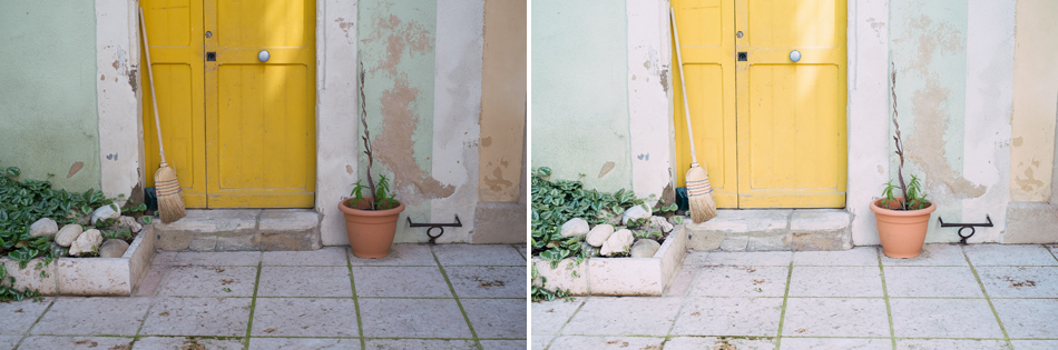
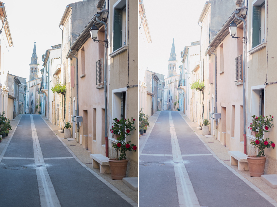
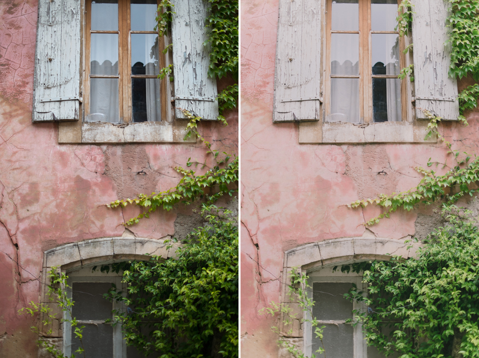
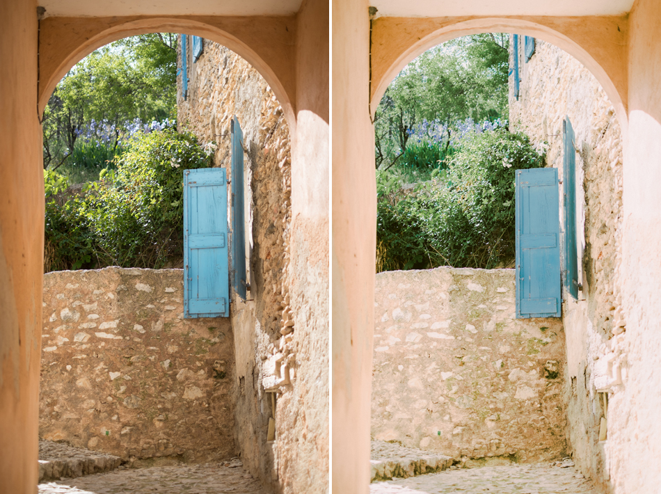
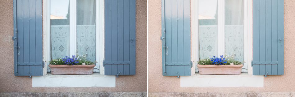
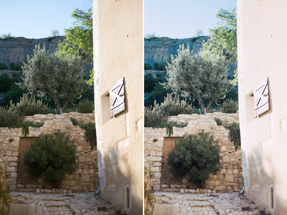
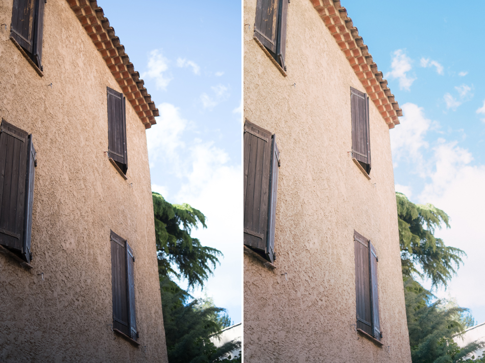
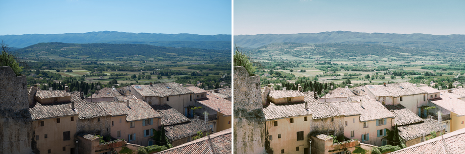
Many of my presets and actions were developed with a pastel look in mind and work exceptionally well with Fuji’s color palette. While my products are not focused on emulating any one film, many of them are inspired by the beautiful Fuji pastel film look.

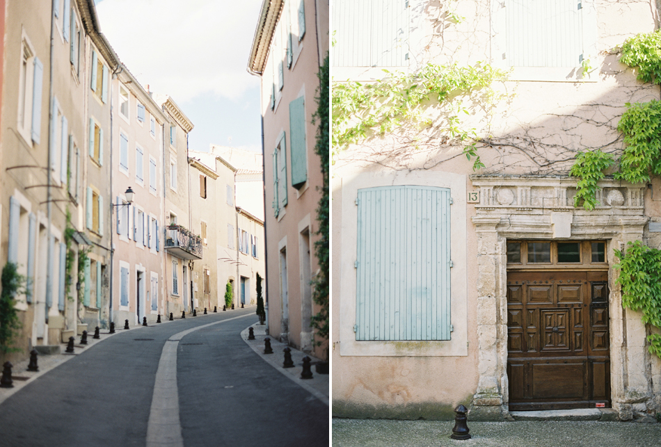
Top: Contax 645, Zeiss 80mm f/2.0, Fuji Pro 400H
Bottom: Fuji X-E1, Fujinon 35mm 1.4, Rebecca Lily preset
If you don’t like extensive post production and would rather prefer a one-click pastel, maybe you’ll find one of these products helpful. They will optimize your exposure and are calibrated to produce a pleasing pastel palette for all camera brands including Fuji. The following examples demonstrate a before/after of some of my Lightroom presets on images shot with my Fuji X-E1 (click to see larger):